
Bounded width
Compact, standard, and wide presets remain inside the available viewport rather than accepting an arbitrary merchant width.
Storefront layout guardrails
Write your message and choose your design. PrimePopup adjusts the layout for available screen space, stacks side images when needed, and lets longer offers scroll inside the popup.
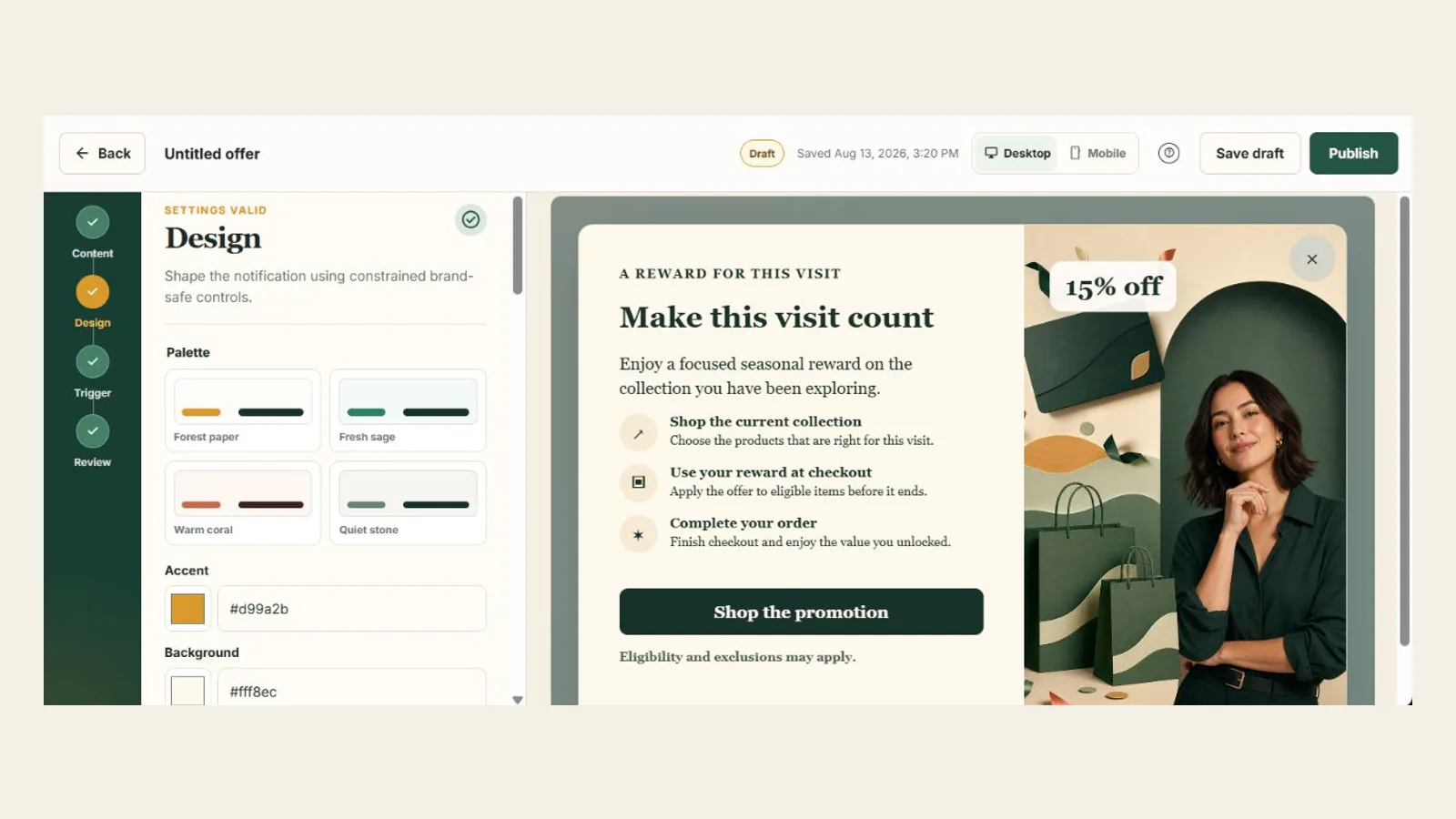
Built-in layout checks
Preview checks help you catch layout problems before publishing. On the storefront, the popup adjusts to the screen and the length of your content.
Compact, standard, and wide presets remain inside the available viewport rather than accepting an arbitrary merchant width.
Long content scrolls inside the popup so the dialog does not extend beyond the usable viewport.
Protected left and right image panels move above the content when the side-by-side minimum width is unavailable.
A composition that would force sideways scrolling is treated as a publish blocker, not a harmless visual suggestion.
Close, button, coupon, and form actions retain touch-safe sizing and remain reachable while content scrolls.
Nonessential animation is disabled when the shopper requests reduced motion.
Blocker or warning?
Horizontal overflow, invalid destinations, missing required content, unsafe block data, expired timers, or malformed campaign state must be corrected.
Internal scrolling, aggressive timing, repeated display, automatic image stacking, or unusually dense content can be valid but deserve attention.
Responsive stacking, reduced motion, bounded sizing, and content containment explain what PrimePopup will do automatically.
PrimePopup isolates its styles and tests representative themes, but custom theme code and other storefront apps can still introduce conflicts. Merchants should preview and verify the published theme.
Before your offer goes live
Close control, internal scroll, stacked image, readable text, and no horizontal overflow.
Touch targets, dynamic browser chrome, backdrop, keyboard focus, and body-scroll restoration.
Protected side-image breakpoints, content density, focus order, and orientation changes.
Viewport height, browser zoom, internal scroll classification, and fixed header conflicts.
Maximum width, visual balance, image cropping, and readable line length.
Reflow, focus visibility, dialog labelling, keyboard dismissal, and control reachability.